Small Stamps, Grand Showcases

Preservation First: Foundations for Miniature Philately
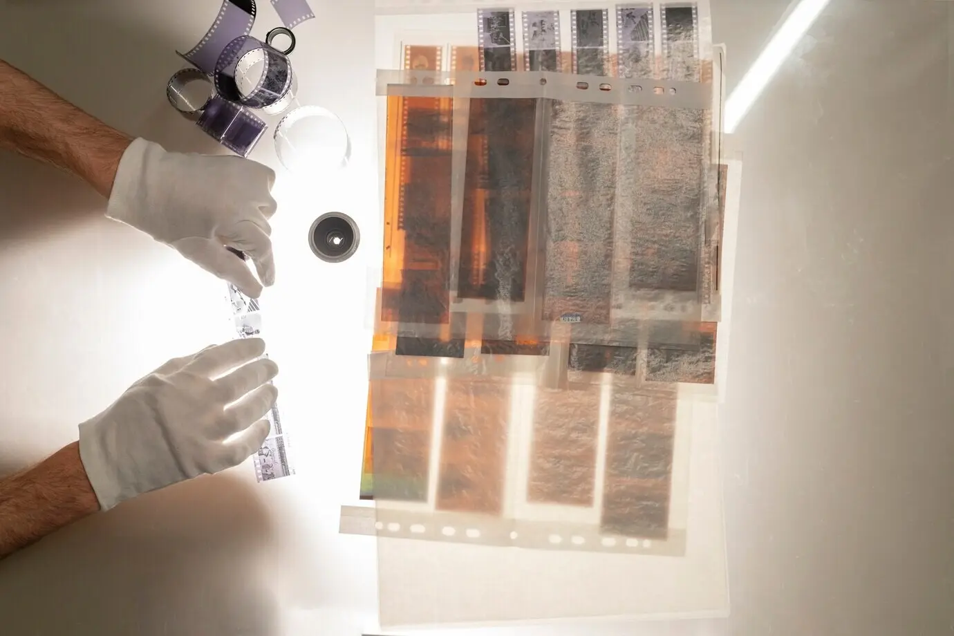
Smart Storage Formats for Very Small Issues

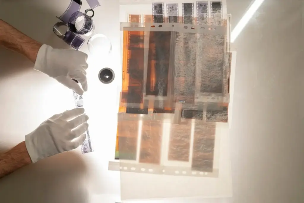
UV glazing and reversible mounting
Choose UV-filter acrylic to reduce weight and shatter risk, especially for rotating displays. Mount stamps within inert sleeves or archival corners adhered to museum board, ensuring full reversibility. Avoid tapes, spray adhesives, and pressure that embosses perforations. A slim spacer creates airflow and prevents contact with glazing. Neutral mats frame attention without distraction. This setup keeps light exposure minimized while enabling easy updates as you refine arrangements, add new acquisitions, or adjust for seasonal conditions.
Shadow boxes with microclimate awareness
Shadow boxes add depth that flat frames cannot, making tiny pieces feel important. Use buffered museum board, low-VOC adhesives around non-critical areas, and hidden silica gel sachets to stabilize humidity. Include tiny vents or breathable backers to avoid condensation in temperature swings. Maintain a safe standoff from glazing to protect perforations. Place the box away from radiators and direct sun. With simple maintenance—occasional gel recharging and dusting—your display remains sharp, stable, and refreshingly dimensional.
Rotating desktop showcases
Small easels, acrylic stands, and tabletop flip-display binders create intimate viewing spaces without permanent framing. Keep a rotation schedule to limit light exposure, and return pages to dark storage between showings. Annotate captions neatly and include magnification aids nearby for visitors. The informality encourages conversation while safeguarding condition. This approach suits tiny stamps beautifully, celebrating detail at arm’s length, and lets you iterate quickly as your collection evolves or specific stories beg for a spotlight.
Lighting, Placement, and Environmental Safeguards
Choosing the right LED
Select LEDs with high CRI for accurate color, but prioritize low brightness and excellent diffusion. Warm to neutral color temperatures (2700–4000K) flatter engraved detail. Place fixtures farther away than you think, and test with a lux meter or reliable phone app. Use dimmers, shades, and reflective surfaces to disperse light. The goal is gentle, even illumination that welcomes viewing while minimizing cumulative exposure. When in doubt, lower intensity and extend longevity through thoughtful rotation scheduling.
Time limits prevent fading
Fading is cumulative, so limit exhibition durations. Set daily windows, log dates, and rest sensitive pieces in dark storage. Consider cloth dust covers for framed sets when not being admired. Museums rotate works on paper for a reason, and your miniatures deserve similar care. Micro-adjustments—shorter on-time, fewer days per week—add up to meaningful preservation. Track habits in a simple spreadsheet, and celebrate each rotation as a fresh story for returning visitors to rediscover.
Placement that prevents accidents
Keep displays away from sinks, stoves, and bathrooms where steam and splatter lurk. Avoid sunny sills, heater vents, and crowded hallways. At eye level, stability matters: use secure hanging hardware and consider discreet earthquake putty for frames on narrow shelves. Provide clearance from curious paws and tiny hands. Think through airflow, dust paths, and cleaning access. Safe placement reduces the need for frequent handling, lowering risk while preserving the calm, focused viewing experience your small stamps deserve.
Arranging Stories in Small Spaces
Captions that guide discovery
Concise labels make miniature works legible. Include date, country, printer, face value, perforation, and watermark when relevant. Add a short anecdote—perhaps where you found it, or a quirky production detail. Consider a tiny QR code linking to high-resolution scans or provenance notes. Keep typography readable with high contrast and sufficient size. Captions are not decoration; they are invitations to linger, compare, and return, transforming a quick glance into a moment of attentive wonder.
Designing breathing room
White space is protective and expressive. Use narrow mats, slim borders, and steady margins to avoid crowded looks that swallow small pieces. A deliberate grid helps alignment stay crisp even at miniature scale. Test multiple layouts with blank placeholders before committing, photographing options for later comparison. Color can support legibility, but restraint prevents distraction. When in doubt, subtract rather than add. Breathing room keeps edges safe and leads eyes unhurriedly from detail to detail with calm clarity.
Curating by journey or maker
Group by route, printer, engraver, or postal history thread, letting relationships tell their own story. Perhaps pair a tiny definitive with a related postmark or a plate variety that invites comparison under magnification. Personal stories resonate: a flea-market find echoing a relative’s correspondence can anchor an arrangement. Connections spark memory and conversation, letting viewers notice subtleties in paper, shade, or impression. Small stamps gain stature when relationships, not quantity, steer selection and sequence.
Digital Companions and Hybrid Showcases
All Rights Reserved.